Paper Collective
Ritmo 02 Art Print See Available Sizes
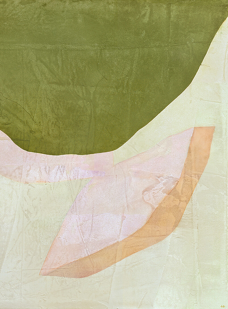
Ritmo 02 is an art print by Mexican artist Berenice Hernandez for Danish brand Paper Collective. Originally painted on canvas and raw linen, the work features abstract forms in green, violet, rose, yellow, and beige, reproduced through jet printing in 12 colors on responsibly sourced matte fine art paper. The print is unframed, printed in Denmark, and available in 30 x 30 cm and 50 x 50 cm sizes.
- Material
- responsibly sourced matte fine art paper
- Style
- modern, contemporary, artsy
- Category
- Arts & Entertainment > Hobbies & Creative Arts > Arts & Crafts
Color
Specifications
Abstract art print by Mexican artist Berenice Hernandez, featuring fluid rhythms in green, violet, rose, yellow, and beige tones, jet printed on matte fine art paper.
Jet printed in 12 colours on thick responsibly sourced matte fine art paper; printed in Denmark; art print only (frame not included); available in 30x30 cm and 50x50 cm sizes.
- Material
- responsibly sourced matte fine art paper
- Style
- modern, contemporary, artsy
- Gender
- unisex
- Condition
- new
- Category
- Arts & Entertainment > Hobbies & Creative Arts > Arts & Crafts
Additional Attributes
- art print
- abstract forms
- green, violet, rose, yellow, beige tones
- originally painted on canvas and raw linen
- jet printed in 12 colours
- responsibly sourced matte fine art paper
- printed in Denmark
- art print only (frame not included)
- available in 30x30 cm and 50x50 cm
- Danish brand
- Mexican artist
- fluid rhythm
- artistic elegance
Product Insights
The Ritmo 02 Art Print blends Mexican illustration, engraving, painting, and textile techniques with Danish design, offering an earth-toned palette inspired by Monterrey's geography and botany. Priced at 80 CAD, it is printed to order in Denmark on 265 gsm FSC-certified paper using 12-colour giclée, ensuring tonal depth and brushwork fidelity. Designed to work alone or in coordinated sets, the matte, full-bleed print (with a slight frame overlap) complements boho and Japandi interiors, though care with UV-filtering glass and handling is advised to prevent fading, and colors appear truest in natural daylight.
Verified claims
- Artist background
- Ritmo 02 uses a mix of illustration, engraving, painting, and textile techniques.
- Inspiration
- Palette and forms draw from Monterrey's geography, botany, and Latin-Danish cultural fusion.
- Collection design
- Designed to work alone or in sets within the Ritmo 01-04 series.
- Series coherence
- Ritmo prints are designed to flow as a set, open-edition, and made-to-order for uniform quality.
- Color harmony
- Ritmo 02's earth-toned palette includes green, violet, rose, yellow, and beige, and these warm organic hues avoid harsh contrast, so the print works cohesively in warm neutral interiors and grouped wall displays.
- Light protection
- Use UV-filtering glass and avoid direct sunlight to prevent fading.
- Framing
- Preserve the print with acid-free backing, sealed frame, and spacer.
- Handling
- Handle the print by edges or with cotton gloves to avoid damage.
- Color palette
- Complements wood, rattan, linen, and terracotta in boho and Japandi spaces.
- Display
- Matte surface eliminates glare; full-bleed image works alone or in groups.
- Artistic narrative
- Mexican artistry meets Danish design for a cultural narrative.
- Material
- Responsibly sourced paper: 265 gsm, FSC-certified, 12-colour giclée, made to order in Denmark.
- Giclée reproduction
- 12-colour giclée captures the original painting's tonal variation and brushwork.
- Freshness
- Made-to-order in Denmark, shipped fresh from the press.
- Care
- UV-filtering glass and careful handling are recommended to prevent fading and marks.
- Production
- Printed to order in Denmark from Paper Collective's own facility.
- Artist curation
- Ritmo 02 is by handpicked long-term collaborator and multidisciplinary artist Berenice Hernandez.
- Color match
- Buyers report colors match product images best in natural daylight.
- Surface reproduction
- 12-color giclée captures original brushwork, weave, and color depth.
- Full-bleed
- The print is full-bleed with no border; the frame lip will overlap the image by a few millimeters.
- Light exposure
- Avoid direct sunlight; view the print in indirect natural light to prevent fading and evaluate colors accurately.
- Movement and rhythm
- The abstract forms rise and fall in a deliberate rhythm, giving Ritmo 02 the sense of movement implied by the Ritmo name.
- Paper weight
- The print is made on heavyweight 265 gsm paper, which feels premium and handles well.
- Paper archival quality
- The paper is FSC-certified and acid-free, which supports long-term color stability and archival quality.
Product record
- Title
- Ritmo 02 Art Print See Available Sizes
- Brand
- Paper Collective
- Price
- 80 CAD
- Availability
- In stock
Buying Guide
1 comparison · 12 sourcesUses
Bringing abstract art into a modern interior
This Ritmo 02 art print by Mexican artist Berenice Hernandez pairs intertwined abstract forms in green, deep violet, rose, yellow, and beige tones. Jet printed in 12 colours on responsibly sourced matte paper, it is designed to add artistic elegance to indoor spaces. It suits modern interiors as a piece from Paper Collective, a Danish brand specializing in high-quality posters.[3,5]
Display the Ritmo 02 print on its own or as part of a set
Paper Collective describes the Ritmo collection as created to work in sets or as single artworks, with forms that rise and fall in a natural rhythm. This print pairs earthy greens and beige with purple highlights, so it can anchor a wall alone or coordinate with other pieces from the collection.[2]
Wall art that arrives ready to hang framed
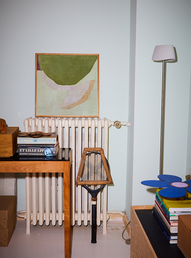
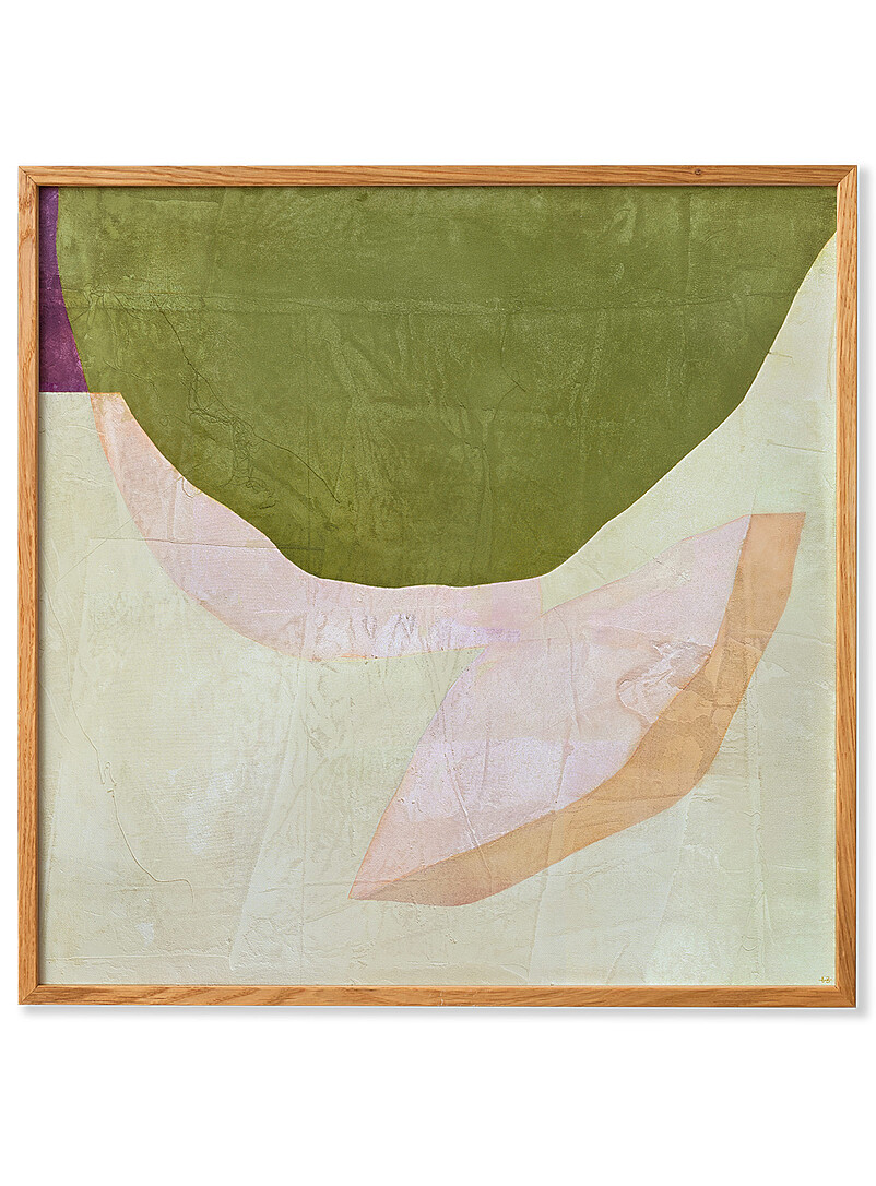
Hang the Ritmo 02 art print as a finished piece on your wall — the product image shows it displayed in a thin light-wood frame with visible grain and mitred corners, enclosing the abstract print on all sides. Its square format and soft palette of olive green, pale beige, pink and tan make it a simple way to add a framed focal point to a room. Note that the framing details come from an analysis of the product image rather than a retailer statement.[6,7]
Product comparison
Compared within this brand.
| Ritmo 02 Art Print See Available Sizes: Choose this if you want a square abstract art print with intertwined forms in earthy greens, beige, pink, and deep violet accents, created by Mexican artist Berenice Hernandez for Paper Collective. It is jet printed in 12 colours as a Giclée fine art print on thick, FSC-certified 265g acid-free matte paper, made to order in Denmark in two sizes (30 x 30 cm or 50 x 50 cm), and designed to work alone or in sets. Note that the frame shown is not included, so you will need to frame it yourself.[1,2,4,5] | Ritmo 03 Art Print See Available Sizes: Choose this if you want a square abstract art print by Mexican artist Berenice Hernandez, whose intertwined organic shapes layer an olive-green field with cream, pale pink, tan, and a small dark accent. It is a 12-colour Giclée print on thick, FSC-certified matte fine art paper, made to order in Denmark, available in 30 by 30 cm and 50 by 50 cm. Note that it is the print only, so a frame is not included.[4,8,9,10] | Composition 01 Art Print See Available Sizes: Choose this if you want a minimal abstract print by Mae Studio, described by the retailer as highly acclaimed, featuring rounded forms in shades of white, grey and black intersected by straight white and red sections. It is a 12-colour fine art Giclee print on matte heavy, acid-free paper, and comes in 30 x 40 cm or 50 x 70 cm sizes in the Patterned Black colorway. Note that at Simons it is sold as an art print only, so a frame is not included, though the brand offers the option of adding one when purchasing.[11,12] |
Image Analysis
3 images- 01
Product
A framed square art print hung on a wall showing abstract shapes in olive green, pale beige, pink and tan; the frame is narrow light wood with visible grain.
- Framed print shapeSquare art print in a narrow light-wood frame, hung on the wall about one radiator width above the floor; frame has a simple rectangular profile and visible wood grain.
1 region
x 0.17 · y 0.12 · w 0.34 · h 0.23 (high) - Print compositionAbstract composition showing a large olive-green curved shape occupying the upper portion of the print, with overlapping pale beige, muted pink and tan curved forms below.
1 region
x 0.20 · y 0.14 · w 0.29 · h 0.18 (high) - Frame finishNarrow, light brown wood frame with visible grain and a matte finish.
4 regions
x 0.17 · y 0.12 · w 0.34 · h 0.03 (medium); x 0.17 · y 0.32 · w 0.34 · h 0.03 (medium); x 0.17 · y 0.14 · w 0.03 · h 0.17 (medium); x 0.48 · y 0.14 · w 0.03 · h 0.17 (medium)
Other
Lifestyle scene showing the framed print above a pale painted radiator in a room with wooden furniture, a vintage wooden tennis racket leaning against the radiator, a stack of books, and a tall floor lamp at right.
- RadiatorVertical-column radiator painted a pale off-white or cream color positioned beneath the framed print; visible pipework and a round valve on the right side.
1 region
x 0.17 · y 0.28 · w 0.33 · h 0.47 (high) - Tennis racket propVintage wooden tennis racket with a triangular wooden protective frame around the strings, the handle painted black at the lower end, leaning upright against the radiator.
1 region
x 0.40 · y 0.55 · w 0.09 · h 0.32 (high) - Wood table cornerCorner of a mid-tone wooden table with square leg at left foreground holding a small stack of books and other objects.
1 region
x 0.03 · y 0.55 · w 0.33 · h 0.39 (high) - Stack of books and flower objectStack of colorful books on a wooden surface at lower right, topped by a flat blue flower-shaped object with a pale center.
1 region
x 0.74 · y 0.68 · w 0.23 · h 0.21 (high) - Floor lampTall, slender floor lamp at right with a thin metallic stem and a small pale lampshade angled slightly, casting a soft shadow on the wall.
1 region
x 0.80 · y 0.06 · w 0.10 · h 0.68 (high) - Books on table text visible“ET LILLE LIV”
1 region
x 0.07 · y 0.52 · w 0.17 · h 0.05 (high) - Books on table text visible 2“HANYA YANAGIHARA”
1 region
x 0.07 · y 0.56 · w 0.17 · h 0.05 (high) - Shot compositionVertical shot framing the mid-left wall area; objects are arranged in layers from foreground furniture to wall-mounted artwork; lighting is soft and even with subtle shadows.
Colors
olive green· large curved shape on print#72743Cpale beige· print backgroundmuted pink· secondary curved formslight wood· frame#727235- Framed print shapeSquare art print in a narrow light-wood frame, hung on the wall about one radiator width above the floor; frame has a simple rectangular profile and visible wood grain.
- 02
Product
Abstract printed art showing large curved color fields on textured paper: a deep olive-green upper field, a pale cream background, a translucent pale pink central shape, and a peach/tan ribbon-like accent; visible paper wrinkles and layered paint texture throughout.
- Upper curved fieldLarge irregular curved color field occupying the image top, with a matte olive-green fill and noticeable brush/printing texture.
1 region
x 0.00 · y 0.00 · w 1.00 · h 0.36 (high) - Background paper fieldPale cream off-white field forming the base layer behind the other shapes, showing creases and paper fiber texture.
1 region
x 0.00 · y 0.36 · w 1.00 · h 0.64 (high) - Central translucent shapeLarge semi-translucent pale pink amorphous shape across the center that reveals paper texture beneath and has softer, irregular edges.
1 region
x 0.08 · y 0.36 · w 0.78 · h 0.48 (high) - Peach/tan ribbon accentNarrow ribbon-like peach to tan shape along the right and lower center with a slightly warmer, more opaque finish than the pale pink shape.
1 region
x 0.62 · y 0.45 · w 0.33 · h 0.45 (high) - Paper surface textureVisible creases, folds, and uneven paper texture across the entire print, including fine vertical and diagonal wrinkle lines and subtle raised areas from layered medium.
- Edge blending between fieldsSoft irregular boundaries where the colored shapes meet the cream background, with slight overlap and visible paper fibers at junctions.
- Small metallic or warm markTiny warm-toned mark or signature near the bottom-right corner separate from the main shapes.
1 region
x 0.94 · y 0.96 · w 0.05 · h 0.04 (medium)
Other
Studio-framed crop of the art print photographed straight-on with even diffuse lighting; image shows the full printed surface within the frame and no packaging or props.
- Shot compositionPortrait-oriented crop showing the printed surface edge-to-edge with no visible frame or mat, centered and filling the image.
- Lighting and shadowEven diffuse lighting with minimal harsh shadows; subtle specular highlights on textured areas indicate slight sheen in places.
- Image qualitySharp focus on surface texture and paint edges; no visible metadata overlays or lens distortion.
Colors
olive green· upper curved field#81843Dpale cream· background paperpale pink· central translucent shape#D3AC7Cpeach tan· peach/tan ribbon#CCA57Awarm gold· small warm mark- Upper curved fieldLarge irregular curved color field occupying the image top, with a matte olive-green fill and noticeable brush/printing texture.
- 03
Product
Framed abstract art print visible front-on: thin light-wood frame surrounding a textured paper print with a large olive-green top shape, pale cream background, translucent pale-pink layered shapes and a tan-orange curved ribbon, plus a small purple wedge at the upper-left.
- Frame material and profileThin rectangular wooden frame with visible wood grain and mitred corners; frame width is narrow relative to overall image and encloses the print on all sides.
1 region
x 0.02 · y 0.02 · w 0.96 · h 0.96 (high) - Background fieldPale cream/very light beige textured paper surface that fills most of the lower two-thirds of the composition and shows visible creases and subtle tonal variations.
1 region
x 0.04 · y 0.29 · w 0.91 · h 0.66 (high) - Large top shapeA broad olive-green curved shape occupying the upper portion of the print, with an uneven lower edge and subtle surface texture and faint lines on its surface.
1 region
x 0.04 · y 0.04 · w 0.91 · h 0.33 (high) - Translucent pale-pink formA wide, ribbon-like pale pink shape crosses from left toward the lower center area; it appears layered and semi-transparent with underlying texture visible.
1 region
x 0.12 · y 0.36 · w 0.66 · h 0.26 (high) - Tan-orange curved ribbonA tan to light orange tapered curved band sits on the right side of the composition overlapping the pale-pink form and extending toward the lower right quadrant.
1 region
x 0.68 · y 0.46 · w 0.25 · h 0.35 (high) - Small purple wedgeA narrow vertical purple wedge is visible along the top-left edge where the green shape meets the frame.
1 region
x 0.04 · y 0.03 · w 0.06 · h 0.10 (high) - Surface texture and creasingPaper surface shows visible fold and crease lines, subtle raised texture, and slight shading variations across the print, most noticeable in the cream and pink areas.
1 region
x 0.15 · y 0.35 · w 0.70 · h 0.55 (medium)
Other
Front-facing product shot centered on a white background with soft shadow; cropped fairly tightly to show the framed print and minimal surrounding margin.
- Shot compositionPrint and frame centered in image, photographed front-on with the frame edges parallel to image borders.
- Background and shadowPlain white studio background with a faint drop shadow below the frame consistent with a light source from above.
1 region
x 0.12 · y 0.94 · w 0.76 · h 0.04 (medium) - Image qualityEven lighting and good sharpness across the framed print; no legible printed text or labels visible on the product surface.
Colors
light oak· frame#CD9253olive green· large top shape#747936pale cream· background paper#D5D9CBpale pink· pale pink ribbon#DBCDD2muted tan orange· tan-orange ribbon#CDA97Ddeep purple· purple wedge- Frame material and profileThin rectangular wooden frame with visible wood grain and mitred corners; frame width is narrow relative to overall image and encloses the print on all sides.
Brand PDP Lookup
- Brand
- Paper Collective
Art Print Ritmo 02